
Animal Crossing: New Horizons UI/UX Case Study
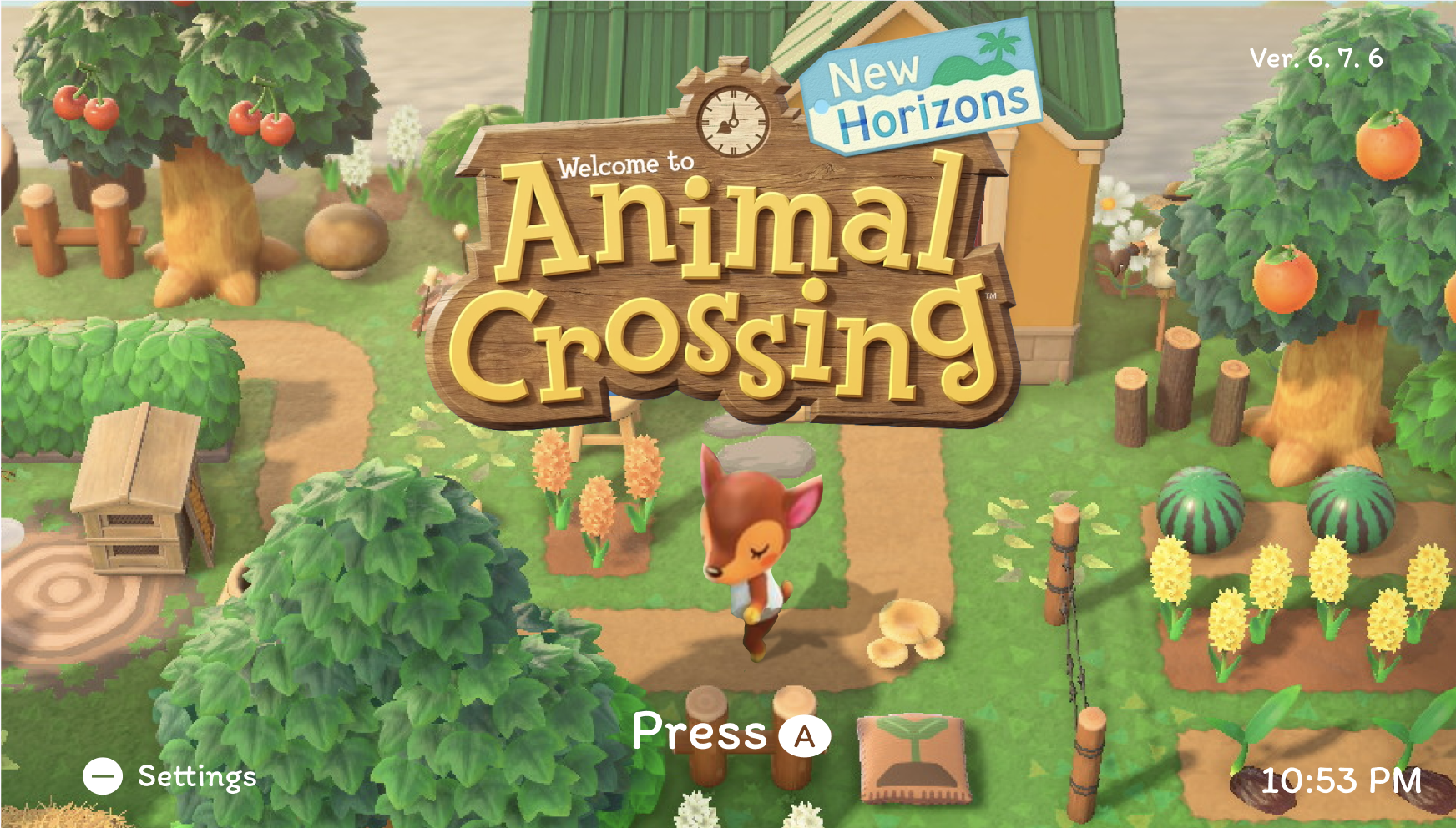
Animal Crossing: New Horizons is a life-simulation game centered around exploration, customization, collection, and building a personalized island community. This case study examines the game through a UI/UX lens, using player research, journey mapping, prototyping, usability testing, and accessibility evaluation to explore opportunities for improving the player experience while preserving the game's established visual identity.
Problem
Animal Crossing: New Horizons balances a large number of activities, menus, items, and interactions within an intentionally simple and playful interface. However, certain interaction patterns can introduce friction through repetitive actions, unclear navigation, or limited visual feedback. The challenge was to identify these pain points from a player's perspective without compromising the relaxed pacing and recognizable design language of the game.
Solution
Using a player-centered design process, I identified opportunities for improvement and translated them into redesigned interface concepts. I developed user flows, paper prototypes, wireframes, and high-fidelity mockups, iterating through usability testing and accessibility evaluation to create solutions that feel intuitive while remaining visually cohesive with the existing Animal Crossing experience.
Role
UI/UX Designer
Timeline
March-May 2026 (10 Weeks)
Project Type
ELVTR UI/UX for Games Mentorship Project
Platform
Nintendo Switch
Tools
Figma, Photoshop
UNDERSTANDING THE PLAYER
To understand how new and returning players experience Animal Crossing: New Horizons, I created a player profile and mapped the early-game journey from the title screen through arrival on the island. This helped me identify where the game's approachable, cozy experience succeeds—and where controls, customization, and onboarding can create friction.
Dina is a 28-year-old barista pursuing her master’s degree who plays games as a way to relax between work and school. Familiar with Animal Crossing: New Horizons, she values its approachable gameplay and charming visual identity, but wants greater freedom to create an avatar that feels representative of her.
Dina needs an experience that gives her greater freedom to express herself without sacrificing the simplicity and charm that make Animal Crossing relaxing.
MAPPING THE EARLY-GAME EXPERIENCE
Next, I mapped the player's onboarding journey from launching the game to beginning life on their island. I documented the player's actions, emotions, decisions, and potential pain points alongside the game's intended experience to identify opportunities for improving onboarding and customization.
ONBOARDING OBSERVATIONS
Onboarding is approachable, but restrictive
The game's guided introduction makes the experience easy for new players to follow, but returning players have limited control over how quickly they progress through familiar onboarding content.
Opportunity: Allow experienced players to skip or accelerate portions of the introductory sequence.
Customization supports expression—but only to a point
Character creation introduces personalization early, helping players establish an emotional connection with their avatar. However, limited appearance options can prevent some players from accurately representing themselves.
Opportunity: Expand appearance options while maintaining the simplicity of the existing customization system.
Familiar controls aren't universal
Nintendo's button conventions may feel intuitive to experienced Switch players, but newer players can struggle to understand visually similar controls and icons.
Opportunity: Introduce clearer contextual guidance during early interactions without overwhelming experienced players.
MAPPING THE PLAYER EXPERIENCE
Before moving into visual design, I mapped Animal Crossing: New Horizons’ onboarding experience to understand how players progress from arriving at the airport to beginning the core gameplay loop. I first created a paper prototype to document the game’s primary interactions, choices, and early onboarding sequence.
FROM PAPER PROTOTYPE TO USER FLOW
Using the paper prototype as a foundation, I translated the onboarding experience into a user flow to better visualize player decisions, alternate paths, and points of return throughout the sequence.
WIREFRAMING & TESTING THE EXPERIENCE
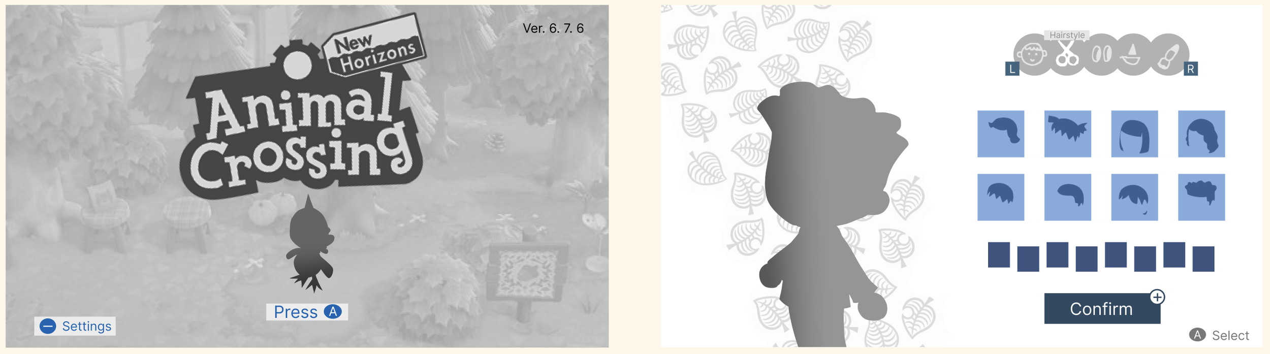
After mapping the onboarding flow, I created low-fidelity wireframes for two key moments in the player experience: the title screen and character customization. I focused on preserving Animal Crossing: New Horizons’ approachable visual hierarchy while identifying opportunities to improve interface clarity and player choice.
USABILITY TESTING
I conducted usability testing with three participants with varying levels of familiarity with Animal Crossing. Participants evaluated the title screen and character customization experience through four tasks measuring two areas: UI clarity and player satisfaction.
Participants: 3 testers with varying ACNH familiarity
Method: Moderated usability testing + post-task questions
Focus: Discoverability, clarity, emotional engagement, and customization
WHAT I LEARNED
Core actions were highly discoverable
Participants successfully identified how to start the game and access settings, suggesting that the title screen's minimal interface effectively communicates its primary actions.
However, some of this understanding relied on existing familiarity with Nintendo's controller conventions, indicating an opportunity to make secondary actions clearer for first-time players.
The title screen successfully communicated "cozy"
Participants consistently described the title screen as pleasant, cozy, and charming, particularly responding to the changing time of day, villagers, and ambient environment.
This validated preserving the environmental focus of the original screen rather than adding additional UI elements.
Customization icons created ambiguity
Participants struggled to interpret several customization categories from their icons alone. Hair and facial-feature symbols were particularly difficult to distinguish at a glance.
This indicated that the interface relied too heavily on abstract icon recognition and needed stronger feedback or labeling.
Players wanted greater customization
All three participants expressed interest in additional character customization, including more hairstyles, colors, and ways to better represent themselves.
Players also wanted more control while making selections, particularly the ability to preview and rotate their character before confirming a choice.

TURNING FEEDBACK INTO DESIGN DECISIONS
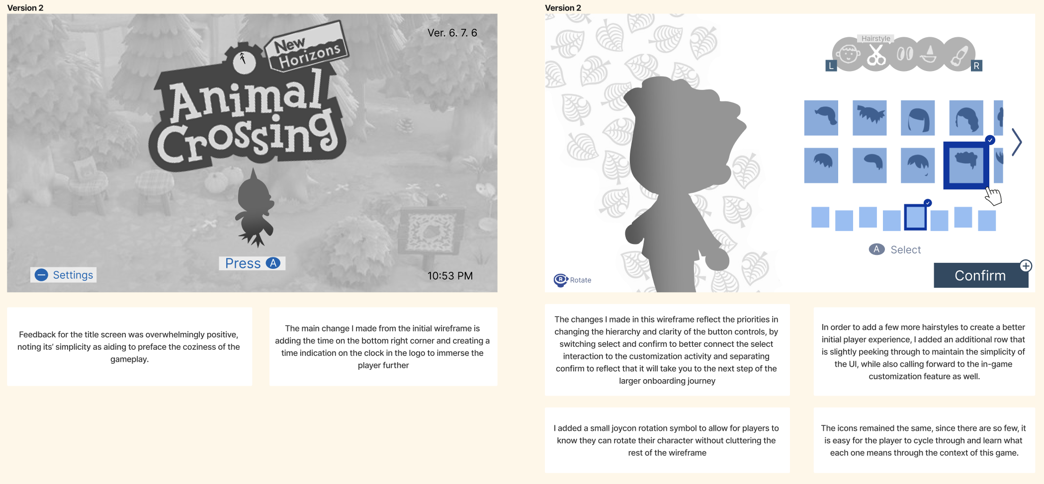
Based on usability testing, I refined the wireframes while intentionally preserving elements participants already found successful. Rather than redesigning the experience from scratch, I focused on targeted changes that improved clarity, customization, and player control without disrupting ACNH's established simplicity.
FINALIZING THE EXPERIENCE
Building on insights from usability testing, I developed the wireframes into high-fidelity screens that preserve Animal Crossing: New Horizons’ playful visual identity while improving clarity and player control.
For the title screen, I retained the environmental focus and minimal interface that testers responded positively to. For character customization, I introduced clearer selection states, additional customization options, and the ability to rotate the avatar before confirming a choice.
DESIGNING FOR ACCESSIBILITY
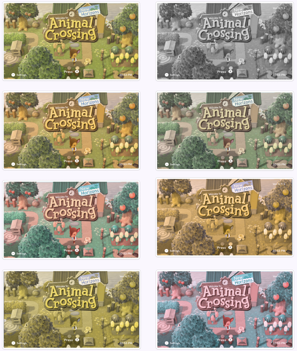
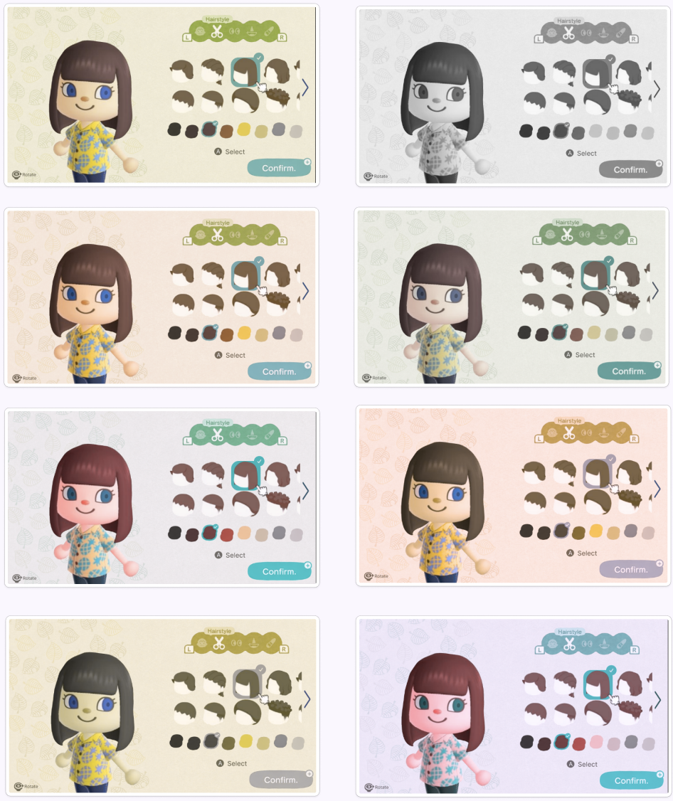
Because color plays a significant role in ACNH's visual identity and interface feedback, I tested the final screens under multiple forms of color-vision deficiency to determine whether important information remained distinguishable without relying on hue alone.
The tests revealed that while the interface remained usable, certain UI elements lost visual distinction when color information was reduced—particularly selection states and controls within the character customization screen.
ITERATING FOR ACCESSIBILITY
Based on the accessibility test, I made targeted adjustments to strengthen visual hierarchy without sacrificing the colorful, playful aesthetic associated with Animal Crossing.

REFLECTIONS
This project taught me that improving an existing experience doesn't always mean reinventing it. Testing showed that many of ACNH's simplest interactions were already successful, so my role became identifying where additional clarity and player agency could be introduced without disrupting what players already enjoyed.
Iterating through usability and accessibility testing also changed how I evaluate visual design. Rather than considering color, hierarchy, and interaction states only aesthetically, I learned to evaluate whether those decisions continue to communicate effectively under different player needs and viewing conditions.
A SPECIAL THANK YOU
Ivy Sang · ELVTR
Jacob Lee · Riot GamesFor their mentorship, thoughtful feedback, and guidance throughout the development of this project.