
See Orcas
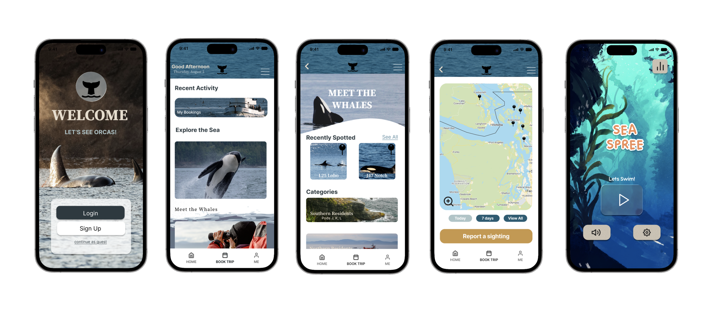
See Orcas is a whale watching app that connects users with the orcas of the Pacific Northwest through real-time sightings, educational content, interactive experiences, and conservation resources. This project explores how a cohesive digital experience can inspire people to get outside, learn about marine life, and support ocean conservation.
Problem
Whale watching information is often fragmented across multiple sources, making it hard for both tourists and local enthusiasts to find reliable, up-to-date sightings, learn about individual whales, or discover meaningful ways to support conservation efforts.
Solution
See Orcas brings everything into one accessible and engaging app. Users can view recent sightings in their area, learn about specific orca individuals, explore interactive games, design custom marine-themed t-shirts, and discover conservation initiatives. By combining education, exploration, and personalization, the app encourages curiosity, builds awareness, and turns interest into action.
Team
Independent Project at Harvard University
Timeline
July – Aug 2026 (6 weeks)
Platform
iOS & Android (Mobile App)
Role
UI/UX Designer
Tools
Figma, Photoshop, Notion
UNDERSTANDING THE USER’S PERSPECTIVE
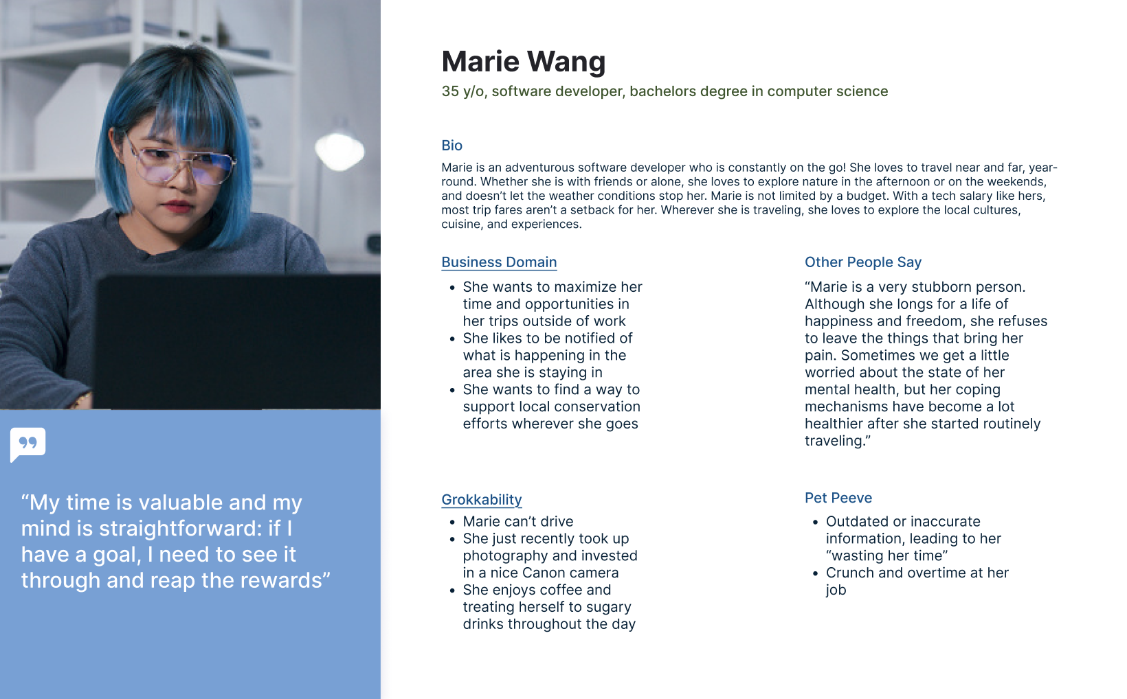
To understand how See Orcas could serve users with different motivations and levels of familiarity with whale watching, I developed two primary personas: the Explorer and the Young Learner. While their needs differ, both highlighted the importance of making information engaging, accessible, and easy to understand.
01 — DISCOVER
Whale Information
05 — ACT
Conservation
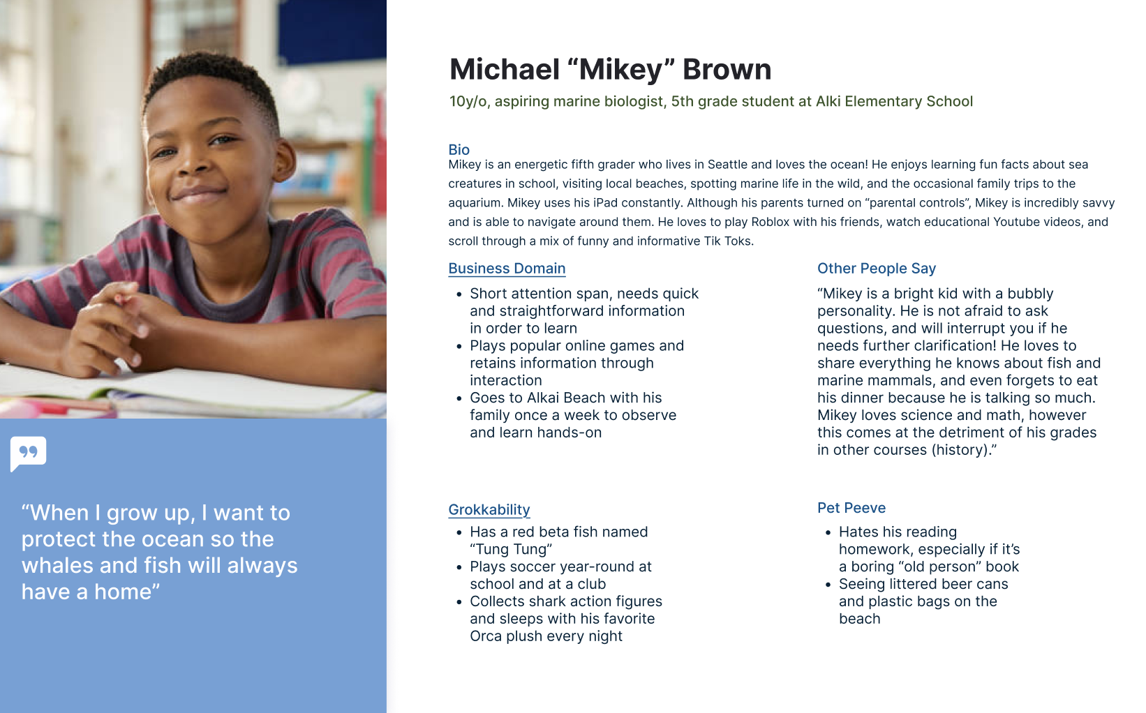
I chose to focus primarily on the Explorer persona to guide the core experience. Marie represents an independent traveler who values her time, seeks meaningful outdoor experiences, and wants reliable information without having to search across multiple sources.
Her primary user story became:
As a marine-loving tourist, I want to be aware of whale sightings in the area so that I can increase my chances of seeing whales and better plan my whale watching experience.
DEEPENING EMPATHY THROUGH NARRATIVE
To better understand Marie beyond a list of traits and behaviors, I wrote an expanded narrative from her perspective, imagining how her work, travel habits, frustrations, and personal values might influence the way she approaches a whale watching experience.
Writing in the first person helped me move beyond what Marie does and consider why she does it. Her demanding career makes her protective of her free time, while travel and outdoor experiences provide an important escape from her everyday routine. At the same time, her environmental awareness creates a desire to explore responsibly and support conservation efforts.
MAPPING THE WHALE WATCHING EXPERIENCE
After developing Marie’s persona and user stories, I mapped her experience across a typical whale watching trip to understand how her needs might change before, during, and after the excursion.
Rather than focusing only on her interactions with the app, I considered the entire experience—from arriving at the dock and waiting to see wildlife to learning about a whale and eventually returning home.
WIREFRAMES & LOW-FIDELITY SCREENS
Based on my user flow and initial sketches, I translated each of See Orcas’ five core experiences into low-fidelity wireframes using Figma. At this stage, I focused on information hierarchy, navigation, and task completion rather than visual styling.
PACKAGE 1
03 — CREATE
Custom Souvenirs
04 — ENGAGE
Interactive Games
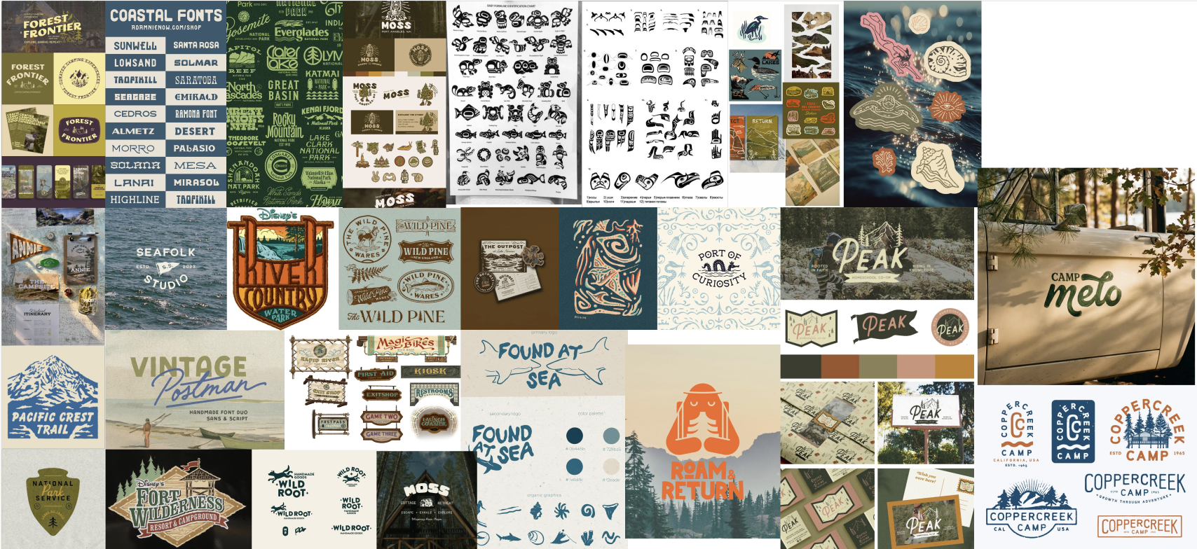
I wanted the application to feel connected to the Pacific Northwest and outdoor exploration without relying on the conventional polished blue aesthetic often associated with marine applications. I gathered references from national parks, campgrounds, field guides, outdoor brands, illustrated signage, and coastal imagery to establish a visual direction that felt adventurous, approachable, and educational.
EXPANDING THE EXPERIENCE
While local sightings established the app’s core utility, additional user stories helped me consider how See Orcas could support users before, during, and after a whale watching experience.
Learn: As an environment enthusiast, I want to learn about individual whales so that I can form a more personal connection with the wildlife I encounter.
Explore: As a marine-loving tourist, I want to see recent whale sightings so that I can make informed decisions about when and where to explore.
Engage: As an avid gamer, I want to learn through interactive activities so that educational content feels engaging and memorable.
Remember: As a sentimental traveler, I want to create a personalized souvenir so that I can preserve memories from my experience.
Contribute: As an environmentally conscious visitor, I want to discover conservation efforts so that I can understand my impact and find ways to help.
IDENTIFYING OPPORTUNITIES
Mapping Marie’s emotional journey revealed three areas where the digital experience could complement the physical whale watching trip:
Reduce uncertainty
Before and during the trip, users need quick access to relevant information such as recent sightings, weather conditions, whale activity, and what to expect from their excursion.
Make downtime meaningful
Long periods of sailing and waiting create opportunities for interactive content. Educational games, whale facts, and individual whale profiles could keep users engaged without distracting from the experience itself.
Extend the experience beyond the boat
Marie’s excitement does not end when she returns to shore. Saving information about whales she encountered, exploring conservation initiatives, and creating personalized souvenirs could transform a temporary excursion into a lasting memory.
These opportunities became the foundation for the app’s core feature set and helped me prioritize features based on where they could provide the most value throughout the user’s journey.
DEFINING THE APP EXPERIENCE
User Flow Diagram
I created a user flow to organize the app’s information architecture and understand how users could move between features without becoming trapped in individual experiences.
Within each feature, I mapped the steps required to complete key tasks—from identifying a recently spotted whale to customizing a souvenir or learning about a conservation initiative.
UI Sketches
With the app architecture established, I began rapidly sketching the screens and interactions needed to support each user flow.
PACKAGE 1 — CONTENT-DRIVEN EXPLORATION
My first exploration focused on creating a content-rich experience with multiple paths to discovery. I experimented with browsing whale collections, navigating between sightings and individual whale profiles, customizing souvenirs, playing educational games, and exploring conservation initiatives.
This direction helped me understand the amount of content the app needed to support, but also revealed the risk of creating too many competing pathways and interactions. I realized that the final experience would need a stronger hierarchy to prevent the app’s educational and secondary features from overwhelming its primary functions.
PACKAGE 2 — TASK-DRIVEN NAVIGATION
For my second exploration, I created a more structured, task-oriented flow. Each major feature received a clearer entry point and a more linear progression: users could identify whales, explore sightings, shop for souvenirs, choose a game, or learn about conservation through dedicated paths.
I also experimented with a persistent bottom navigation system to make the app’s primary features accessible throughout the experience.
Compared with Package 1, this approach created clearer expectations about where users were, what they could do, and how they could move between features.
02 — LOCATE
Recent Sightings
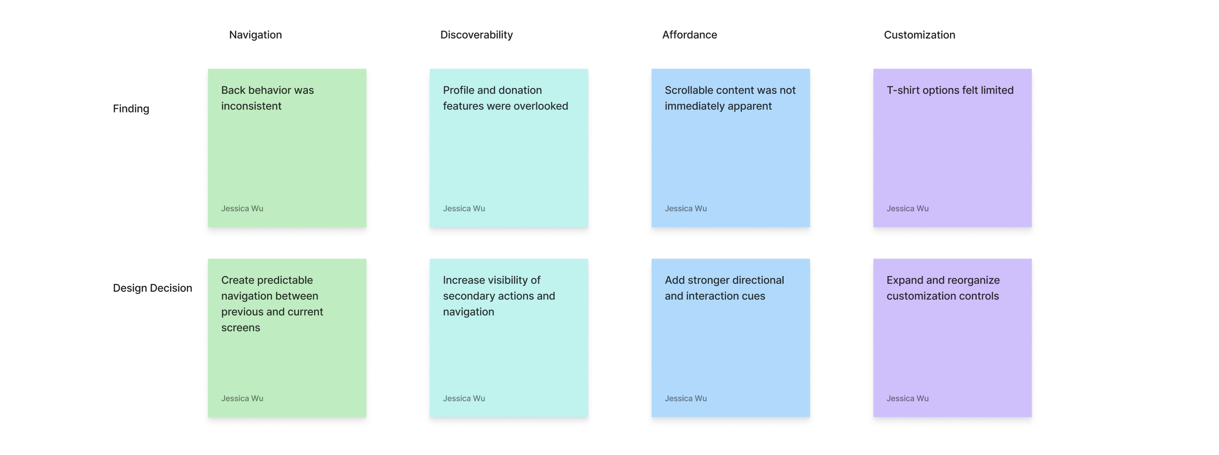
The test showed me that successful navigation was not only about whether users could reach a destination, but whether the interface clearly communicated where they could go next. These findings pushed me to simplify navigation, strengthen visual cues, and combine the most successful elements of both prototype directions.
Finding the Right Voice
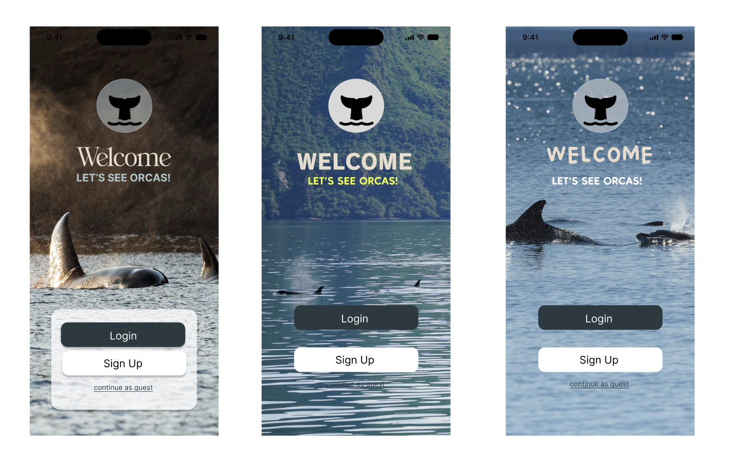
I explored multiple typography and logo combinations to determine how the personality of See Orcas could translate into the interface.
Early directions ranged from editorial serif typography to bold geometric and hand-drawn lettering. I then applied three promising directions to the same welcome screen, allowing me to evaluate them within the actual interface rather than selecting a typeface in isolation.
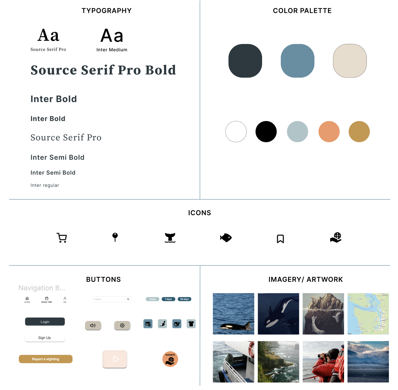
With the visual direction established, I translated the brand into a reusable design system for the final prototype. The system combines Source Serif Pro and Inter with a coastal palette of deep blue-gray, ocean blue, warm cream, muted aqua, coral, and ochre. The restrained UI system allows photography and illustrated elements to provide personality while maintaining clear hierarchy and legibility across information-heavy screens.
PACKAGE 2
TESTING THE LOW-FIDELITY PROTOTYPES
To evaluate my initial design directions, I turned both low-fidelity packages into interactive prototypes and conducted a moderated usability test. I asked the participant to explore key features—including whale profiles, local sightings, conservation resources, souvenirs, and navigation—while thinking aloud.
Rather than directing the participant toward specific screens, I observed how they naturally moved through each prototype, where they hesitated, and which interactions they expected to be available.
REFLECTING ON THE RESEARCH
Recognizing the Limits of My Test
As my first usability test, this session also revealed weaknesses in my research process, not just my interface.
My participant was highly technologically literate and quickly understood many familiar interface conventions. While this supported the learnability of the design, it also meant that the session represented only one type of user and produced less friction than I might expect from a broader audience
If I continued testing, I would recruit participants with different ages, levels of technological familiarity, and experience with whale watching.
Key Takeaway
Usability testing wasn't only a test of my prototype—it was a test of my assumptions as a designer.
The session helped me identify interface problems, but it also taught me to be more intentional about participant selection, question phrasing, and the difference between observing user behavior and guiding it.
DEFINING THE VISUAL DIRECTION
From Wireframes to Visual Identity
After validating the core navigation and identifying usability improvements through testing, I began developing a visual identity for See Orcas.
REFINING THE FINAL EXPERIENCE
Bringing Research, Testing, and Visual Design Together
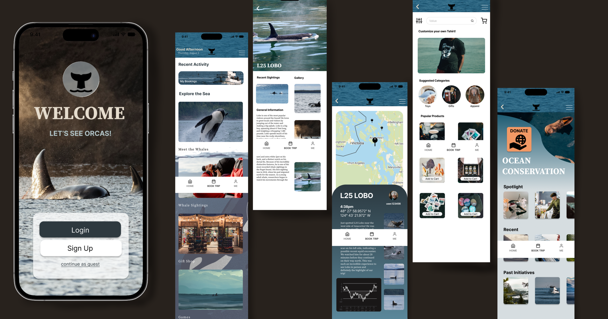
Based on findings from usability testing, I combined the strongest elements of my two low-fidelity prototypes into one final experience. I refined navigation, strengthened interactive cues, increased the visibility of previously overlooked features, and applied the new visual system consistently throughout the application.
The final prototype brings together the project's five core experiences: discovering individual whales, tracking recent sightings, exploring souvenirs, playing educational games, and learning about conservation.
FINAL REFLECTION
WHAT I LEARNED
See Orcas began as an exploration of how a whale-watching application could connect tourists and enthusiasts with information that often exists across disconnected resources. Through research, user flows, sketching, prototyping, testing, and visual development, the project evolved into a broader companion experience centered around discovery, education, and conservation.
As my first end-to-end UX project, the biggest lesson was learning to separate my assumptions as a designer from the behavior of the user. Features that seemed obvious while designing the interface were not always immediately discoverable during testing. Watching someone navigate the prototype changed how I thought about hierarchy, affordances, and familiar interaction patterns.
The project also taught me that iteration does not always mean choosing one solution over another. Testing two different prototype directions helped me identify successful elements within both and combine them into a stronger final system.
If I Continued the Project
I would conduct additional usability testing with a broader range of participants, particularly users with different levels of technological familiarity and whale-watching experience. I would also test the sightings map in a real-world whale-watching environment, evaluate accessibility and outdoor readability, and further develop the reporting and conservation features.
EXPERIENCE SEE ORCAS
Explore the final interactive prototype! For the best experience, open the prototype in full screen.